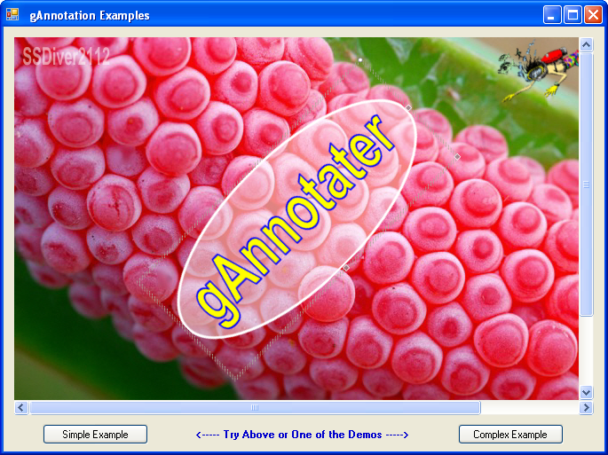
gAnnotation - Add Annotations or Watermarks to an Image (VB.NET)
Introduction
The gAnnotation is a control library that allows text to be added to an image for annotation or watermarking. There are three components to the library: gAnnotater, gCanvas, and gCanvasData. The gCanvas holds and displays the image and gAnnotater collection. It also allows the image to be panned and zoomed. The gAnnotater class is the object that can be added to the gCanvas and manipulated directly on the screen. Each gAnnotater object can be re-sized and rotated by dragging the handles with the mouse. The last is the gCanvasData that allows the Project to be serialized for saving.
There is also a bonus gFontToolStripControls library with custom ToolStrip controls for Fonts, Colors, and Ranged Value Adjustment aka Slider. There are also WinForms versions of each if you need to put them directly on a Form or Dialog. These can be used with the gAnnotation as in the "Complex" demo here or use them by themselves in another project.
The gAnnotater is a rectangular object that draws an image of the gAnnotater on a Graphics Object. The appearance can be changed with the many properties.
Key gAnnotater Properties
Here is a list of the primary properties:
Text, TextColor, TextOpacityAll adjust the
Text string's value, Color and transparencyTextOutline, TextOutlineColor, TextOutlineOpacityAll adjust the Outline Width, Color and Transparency around the
TextBackColor, BackOpacity, BackgroundImageSet the Background to a color or Image and the transparency
BorderType, BorderColor, BorderWidth, BorderLineHandle the appearance of the Border around the Control
RotateAngleGet or Set the Rotational angle of the control
gAnnotater Anatomy

Each RectangleF identifies each area of the gAnnotater. Rect is the outer boundary. RotateRect is the small square in the upper right corner used for rotating the control with the mouse. ResizeRect, ResizeRectVert, and ResizeRectHorz are used for re-sizing the control with the mouse. Their use will be explained in more detail later in the gCanvas section.
Rotation
The rotation and re-sizing of the control is based on information about the mouse position that is coming from the gCanvas. A Graphics Matrix is used to rotate the gAnnotater. To do this, create a Matrix and pass the angle and pivot point with the RotateAt function. A Matrix cannot rotate a Rectangle directly, but it can rotate a Point Array. Each Rectangle needs to be converted with the RectToPoints function.
Private Shared Function RectToPoints(ByVal rect As RectangleF) As PointF()
    Return New PointF() { _
        rect.Location, _
        New PointF(rect.Right, rect.Top), _
        New PointF(rect.Right, rect.Bottom), _
        New PointF(rect.Left, rect.Bottom)}
End Function
The SetPoints routine will convert the Rectangles to points and rotate them with the Matrix.
Private Sub SetPoints()

    'Create a point array of the Rectangles
    ptsRect = RectToPoints(Rect)
    ptsRotateRect = RectToPoints(RotateRect)
    ptsResizeRect = RectToPoints(ResizeRect)
    ptsResizeRectHorz = RectToPoints(ResizeRectHorz)
    ptsResizeRectVert = RectToPoints(ResizeRectVert)

    Using mx As Matrix = New Matrix
        'Rotate the Matrix at the center point
        mx.RotateAt(-RotateAngle, ptCenter)

        'Rotate the points for the mouse trapping
        mx.TransformPoints(ptsRect)
        mx.TransformPoints(ptsRotateRect)
        mx.TransformPoints(ptsResizeRect)
        mx.TransformPoints(ptsResizeRectHorz)
        mx.TransformPoints(ptsResizeRectVert)
    End Using

End Sub

Re-Size
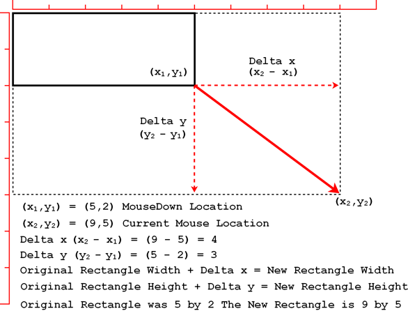
To re-size the control, just re-construct the Rect with new dimensions using the mouse position returned by the gCanvas and the Rect.Location.

Re-Size while Rotated
The tricky part was re-sizing a rotated rectangle. After failing to come up with some brilliant way to easily calculate this, I realized re-sizing was really the same no matter what the rotation is if you look at it with the surface rotated too. So I simply un-rotate, re-size based on the (X,Y) Deltas, and rotate back. Just be sure to get the new centerpoint before rotating back. More details on Rotation will be in the gCanvas section.
BuiltImage Property
Rather than re-building the control every time it is painted, I store an image of the gAnnotater so it can be painted immediately if no re-building is necessary. When the gAnnotater is Selected, a Selection Rectangle is drawn to highlight the areas of mouse interaction.
gCanvas
The gAnnotater is only a class that builds the image. Now we need a way to display it, add it to an image, and interact with it. The gCanvas is a control that can be dropped on a Form and do just that. The gCanvas has an Image Property to hold the image to be annotated. If the image is bigger than the gCanvas, it can be panned or zoomed.
Now that you have an image loaded, add as many gAnnotaters as needed and change the appearance to suit your needs. Move, re-size, and rotate each as well. When you are done, the Assembled Image can be exported as one image or saved as a project to be re-loaded and edited later.
At first, I thought I could just use a Panel and use the built in ScrollBars, but there is a strange "bug?" that causes the scrollbars to reset to zero with focus changes. After playing with different ideas, I realized I would have to make this a custom control. Structurally, it is very simple. The control surface plus one Horizontal ScrollBar and one Vertical ScrollBar. Even these scrollbars have their own quirks, but this could be worked around.
Like the gAnnotater, the gCanvas has an image property to store the completely assembled image in. This is useful for panning and zooming where re-building is not necessary.
gCanvas Mouse Events
The mouse events handle the panning of the image, and the moving, re-sizing, and rotating of the gAnnotaters.
Mouse Down
Checks if the pointer is over the currently selected gAnnotater, set the position and flags for moving.
- If it is, check if it is over one of the editing hotspots.
- If over
RotateRectset the position and flags for rotating. - If over one of the
ResizeRectsset the position and flags for re-sizing. - If it is over a
gAnnotaterthat is not selected, then un-select the current one and select this one. - If the
gAnnotatersare overlapping, hold the shift key down to select the next one under the current one. - If the mouse is not over any of the
gAnnotatersand the image is bigger than thegCanvas, set the position and flags for panning.
Mouse Move
If no button is pressed and it is over the selected gAnnotater, check if it is over a hotspot and change the cursor accordingly. I used techniques from the gCursor[^] to make a custom cursor because the regular sizing cursors don't look right on the rotated gAnnotater. The custom cursor lets me rotate the cursor to match the rotated control.
If the left button is pressed while moving, then take the appropriate action based on the flag set in the MouseDown Event.
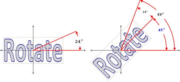
Rotation
For rotation, the position of the mouse must be converted into an angle. I use Trigonometry and Geometry to do this or for some of us just look at the pictures and think of it as magic. The getAngle function will determine the angle from one point (center) to another point (the mouse down location). The Math.Atan2 function will give the angle in radians between two points.
One radian is the angle at which the length of the arc along the circle is equal to the radius. In the below example, take the radius line and stand it up. Then bend it around the circumference. The angle to the point at the end of the line is one radian.

180 degrees (half way around a circle) of any circle will equal to 3.14 lengths of the radius (radians). 3.14 is commonly called pi.
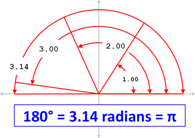
The Math.Atan2 function returns 0 to -3.14 if you are on the positive side of the Y axis, and 0 to 3.14 on the negative so the Return calculation will convert the radians +/- to degrees.
Private Function getAngle(ByVal Origin As PointF, _
                                ByVal XYPoint As PointF) As Integer

    Dim angleRadians As Double = Math.Atan2( _
                                 (XYPoint.Y - Origin.Y), _
                                 (XYPoint.X - Origin.X))

    Return CInt((180 / Math.PI) * (angleRadians Mod (2 * Math.PI)))

End Function
The MouseDown for rotation occurs in the upper right corner of the gAnnotater, so the MouseDown Location is not going to be the actual rotation angle for the gAnnotater. The angle of the corner point must be subtracted from the Mouse location to get the correct angle.
Re-Size, Pan, and Move
Panning, moving and re-sizing all deal with a simple offset of what location did the mouse start and where is it now. Then apply that difference to the original point.
frmTestFormSimple
The frmTestFormSimple Form demonstrates a simple example of how easy it is to throw the gCanvas on a Form, add a few controls to help interact, and your working.
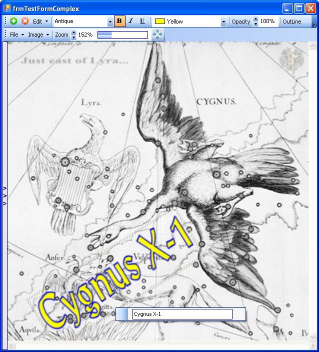
frmTestFormComplex
The frmTestFormComplex Form shows how the controls can be jazzed up by using it in conjunction with your favorite editing controls.
Custom ToolStripItems
OK, raise your hand if the ColorDialog and FontDialog are in your favorites list. Anyone...
They work good, but for real editing, they can be cumbersome. Making your own ToolStripItems is actually pretty easy. If you have ever made your own custom ComboBox, you are almost done. I am not going to go into too much detail on a custom ComboBox because there are plenty of examples on CodeProject already.
To make the custom ToolStripComboBox, add this to the beginning of the Class:
Imports System.Windows.Forms.Design

<System.ComponentModel.DesignerCategory("code")> _
<System.Drawing.ToolboxBitmapAttribute(GetType(ComboBox))> _
<ToolStripItemDesignerAvailability(ToolStripItemDesignerAvailability.All)> _

Public Class gTSColorPicker
    Inherits ToolStripComboBox
    .
    .
    .
And this in the Sub New():
Public Sub New()
    MyBase.New()
    ' This call is required by the Windows Form Designer.
    InitializeComponent()
    ' Add any initialization after the InitializeComponent() call.
    ComboBox.DrawMode = DrawMode.OwnerDrawFixed
    AddHandler ComboBox.DrawItem, _
   	    New DrawItemEventHandler(AddressOf List_DrawItem)
Now add your other custom ComboBox stuff, and when you are done the new control will show up in the DesignTime menu of the ToolStrip.

Font Picker Points of Interest
There are two properties that work together if you are interested to allow you to use fonts that are not currently installed.
PrivatePathThe Path as
Stringto the folder that has the FontsCollectionTypeSet this to
PrivateFonts
Now the fonts in that folder will be in the Font Picker.
The GetFontStyle function keeps things from crashing when you try to use a Font that doesn't have all the FontStyles. For example, some Fonts only have a FontStyle of Bold, so when you try to use it as regular... Crash. This will return an acceptable Style.
Public Shared Function GetFontStyle(ByVal fFamily As FontFamily) As FontStyle
    Dim fStyle As FontStyle
    'Some Fonts don't have all FontStyles
    'This will Determine a fontStyle that is acceptable to this FontFamily

    If fFamily.IsStyleAvailable(FontStyle.Regular) Then
        fStyle = FontStyle.Regular
    ElseIf fFamily.IsStyleAvailable(FontStyle.Bold) Then
        fStyle = FontStyle.Bold
    ElseIf fFamily.IsStyleAvailable(FontStyle.Italic) Then
        fStyle = FontStyle.Italic
    ElseIf fFamily.IsStyleAvailable(CType(3, FontStyle)) Then
        'There is no text enumeration for Bold/Italic but the value is 3
        fStyle = FontStyle.Bold Or FontStyle.Italic
    ElseIf fFamily.IsStyleAvailable(FontStyle.Underline) Then
        fStyle = FontStyle.Underline
    End If
    Return fStyle
End Function
gTSSizer

The gTSFontPicker and gTSColorPicker both inherit the ToolStripComboBox. The gTSSizer inherits the ToolStripItem. The Paint is taken over to make a custom face on the control. It has a built in slider control that can be hidden if more space is needed on the ToolStrip. TrackBars are easier to deal with if the value is an Integer. Use the ValuePrecision property to get a decimal value. When setting the Value, convert it to an Integer by reversing the Precision or just use the ValueAdjusted property to use the decimal value.
Current Issue: When the gTSSizer is in a ToolStripDropDownButton like in the Edit menu, the menu closes up when you release the mouse button. I have not found a way to force the menu drop down to remain open for multiple changes to the control.
Here is a list of the primary properties:
Value, Minimum, MaximumThese control the
Valueand its limitsResetValueWhen Right-Clicked, the
Valuewill be set to this valueAValuePrecision, ValueAdjustedThe
ValueAdjustedis the Value adjusted by theAValuePrecisionValueToDisplay, ValueStrFormatSets whether to display the
Valueor theValueAdjusted, and theValueStrFormatadds formatting to the displayed valueValueBoxWidthGet or Set the width of the box around the displayed
ValueBarWidthGet or Set how wide the Slider Bar is
Animate, AnimateSpeedGet or Set the if the control will open and close to expose the slider, and how fast to do it
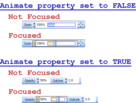
Note: Remember these can be added to a StatusStrip or ContextMenu as well. For example, you may want the Zoom control on the bottom in a StatusStrip.
gSizer, gFontPicker, and gColorPicker
Also included are WinForms versions of the controls. Examples of these are in the side flyout panel. They are the same controls with some slight adjustments to make them work directly on a Form.

frmTestFormComplex Usage Tips
- Right click on the
gCanvasto add agAnnotaterat that location or click the green plus button to add one in the center of the display. - Right click on the current
gAnnotaterto edit the text. - Play around with the other controls to edit the appearance.
Serialization
Using System.Xml.Serialization, you can convert the current state of a class into a saveable XML file. In other words, the current values in the properties are saved. Then, when re-loaded later, it will be just like it was when it was saved. In a perfect world, I would say you just serialize (save) the class and you are done, but this world is far from perfect, so we have some issues to deal with. Not all properties are serializable (of course). Properties like Strings, Integers, Double, Rectangle, DashStyle, Array, and so on are fine. Fonts, Colors, and Images are not so fine. To get around this problem, you have to create a Structure made out of Serializable properties to represent the Un-Serializable property.
Serializable Font
Disassemble the Font into Serializable the parts. The FamilyName as String, emSize as Single, and FontStyle as FontStyle.
    Public Structure SerialFont
        Public fSize As Single
        Public fName As String
        Public fStyle As FontStyle

        Public Sub New(ByVal font As Font)
            fSize = font.Size
            fName = font.Name
            fStyle = font.Style
        End Sub
    End Structure
Create a normal Font Property, but add the Xml.Serialization.XmlIgnore Tag so the process will not crash with an error.
Private _font As Font = New Font("Arial", 10)

<Xml.Serialization.XmlIgnore()> _
Public Property Font() As Font
    Get
        Return _font
    End Get
    Set(ByVal value As Font)
        _font = value
        BuildImage()
    End Set
End Property
Now create a Serializable pseudo Font Property that will assemble and disassemble the SerialFont Structure.
<Xml.Serialization.XmlElement("Font")> _
<Browsable(False)> _
Public Property Sfont() As SerialFont
    Get
        Return New SerialFont(_font)

    End Get
    Set(ByVal value As SerialFont)

        _font = New Font(value.fName, value.fSize, value.fStyle)

    End Set
End Property
Serializable Color
The Color Property uses the same basic principle except it has an extra check to set the Name of the Color if it is a KnownColor.
Public Structure SerialColor
    Public Name As String
    Public A As Integer
    Public R As Integer
    Public G As Integer
    Public B As Integer

    Public Sub New(ByVal color As Color)
        Name = color.Name
        A = color.A
        R = color.R
        G = color.G
        B = color.B
    End Sub
End Structure

Private _TextColor As Color = Color.Black
<Xml.Serialization.XmlIgnore()> _
Public Property TextColor() As Color
    Get
        Return _TextColor
    End Get
    Set(ByVal value As Color)
        _TextColor = value
        BuildImage()
    End Set
End Property

<Xml.Serialization.XmlElement("TextColor")> _
<Browsable(False)> _
Public Property STextColor() As SerialColor
    Get
        Return New SerialColor(_TextColor)

    End Get
    Set(ByVal value As SerialColor)

        If Color.FromName(value.Name).IsKnownColor Then
            _TextColor = Color.FromName(value.Name)
        Else
            _TextColor = Color.FromArgb(value.A, value.R, value.G, value.B)
        End If

    End Set
End Property
Serializable Image
The Image Property doesn't need a custom Structure because the Image can be converted into a Byte Array which is serializable.
Private _backgroundImage As Bitmap

 <Xml.Serialization.XmlIgnore()> _
 Public Property BackgroundImage() As Bitmap
        Get
            Return _backgroundImage
        End Get
        Set(ByVal Value As Bitmap)
            _backgroundImage = Value
            BuildImage()
        End Set
    End Property

    <Xml.Serialization.XmlElement("BackgroundImage")> _
    <Browsable(False)> _
    Public Property PictureByteArray() As Byte()
        Get
            If Not _backgroundImage Is Nothing Then
                Dim bitmapConverter As TypeConverter = _
                    TypeDescriptor.GetConverter(_backgroundImage.GetType)
                Return CType(bitmapConverter.ConvertTo( _
                    _backgroundImage, GetType(Byte())), Byte())
            Else
                Return Nothing
            End If
        End Get
        Set(ByVal value As Byte())

            If Not value Is Nothing Then
                _backgroundImage = New Bitmap(New IO.MemoryStream(value))
            Else
                _backgroundImage = Nothing
            End If

        End Set
    End Property
gCanvasData
The gCanvasData is a small Serializable Class that can hold the List (Of gAnnotaters) and the Image. This is the Class that is saved as a Project .gap file. The Serializer uses a StreamWriter to save the data to the XML file. You can save it with the .xml extension or create your own if you want. I used gap for "gAnnotater Project".
Dim SaveData As New gCanvasData

Using objStreamWriter As New StreamWriter(sfdlg.FileName)
    Dim x As New XmlSerializer(GetType(gCanvasData))
    x.Serialize(objStreamWriter, SaveData)
    objStreamWriter.Close()
End Using
History
- Version 1.0.0 - July 2011
- First published version
- Version 1.0.1 - July 2011
gTSSizerre-designed due to initialization problems
- Version 1.0.2 - July 2011
gTSSizer Totalre-design, removedDropdownand added expansion feature- Updated the
gCanvas Imageproperty to handle indexed images like GIFs - Simplified the Image Transparency code using Matrix33
- Changed the value range used for setting the Matrix33 to Single value from 0 to 1
- Changed the
Opacityproperties value range from 0-255 to 0-100 for real world readability and make the conversion internally
- Version 1.0.3 - July 2011
gCanvaschanged ordering ofgAnnotatesto be drawn first created behind the next one created- Selection with the Shift Key starts at the topmost and works its way back
- Added
gSizer,gFontPicker, andgColorPicker- WinForms versions of theToolStripcontrols. - Added a Flyout Panel on the Complex form to illustrate the WinForms controls
- Minor miscellaneous other tweaks
- Version 1.0.4 - July 2011
FontPicker- Switched theGraphics.DrawStringtoTextRenderer.DrawTextfor better speed- Minor efficiency tweaks
发表评论
 is cbd legal in wash[89.28.10.*]2020/9/29 3:33:18#2
MDBzOy I truly appreciate this post. I have been looking everywhere for this! Thank goodness I found it on Bing. You ave made my day! Thx again!
4eZisR You have made some decent points there. I looked on the web for more info about the issue and found most people will go along with your views on this site.